
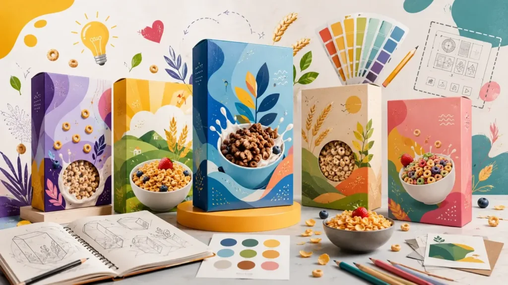
Cereal box design influences purchasing decisions long before customers taste the product inside. Shoppers often compare several breakfast cereals within a few seconds, making packaging one of the strongest factors in attracting attention and communicating product quality. Successful cereal packaging combines eye-catching visuals, clear branding, thoughtful structure, and practical functionality to create a memorable first impression that encourages shoppers to pick up the box instead of a competing product.
Popular cereal box design ideas continue to evolve as consumer preferences change, but the most effective packaging always balances creativity with usability. Bright graphics may appeal to children, while minimalist layouts and natural colors often resonate with health-conscious shoppers. Premium finishes, sustainable materials, and interactive features also help brands stand out in crowded retail aisles. Whether you’re launching a new breakfast cereal or refreshing an existing product line, the following design ideas and packaging strategies will help you create boxes that strengthen your brand identity and improve shelf appeal.
Why cereal box design influences buying decisions
Cereal packaging does much more than protect the product during shipping and storage. Retail shoppers frequently form opinions about quality, flavor, and brand credibility before reading a single product detail. Strong packaging design creates an immediate visual connection that helps consumers recognize your brand and understand what makes your cereal different from dozens of competing products.
Successful cereal boxes also follow a clear visual hierarchy that guides shoppers through the most important information. Most consumers notice the logo first, followed by the product name, product image, key selling point, and flavor. Organizing these elements in the right order improves readability and allows shoppers to understand the product within seconds. Brands that combine attractive graphics with clear messaging often enjoy better shelf visibility and stronger brand recall than products with cluttered or confusing layouts.
Essential design elements every cereal box should include
Creative packaging begins with a strong design foundation. Before selecting artwork or printing finishes, every cereal brand should focus on the visual elements that influence customer perception and purchasing behavior.
Build a clear visual hierarchy
Visual hierarchy helps customers process information quickly while browsing retail shelves. Large logos, readable product names, and a prominent product image should naturally guide the eye without overwhelming the front panel. Supporting information such as nutritional highlights or unique selling points should remain easy to find without competing with the primary branding.
Choose colors that match your target audience
Color selection should reflect both your product category and your ideal customer. Children’s cereals often perform well with energetic combinations of yellow, blue, orange, and red because these colors communicate excitement and fun. Organic granola and whole-grain cereals typically benefit from earthy greens, warm browns, and soft neutrals that reinforce freshness and natural ingredients. Premium breakfast products frequently rely on restrained color palettes with subtle accents to create a refined appearance that increases perceived value.
Select typography that remains readable
Typography influences both brand personality and product recognition. Bold sans-serif fonts usually improve readability from several feet away, making them ideal for retail environments where shoppers scan shelves quickly. Decorative display fonts can highlight product names or seasonal editions, but supporting information should always remain clean and easy to read.
Use imagery that reinforces your brand story
Product imagery should communicate exactly what customers can expect inside the box. High-quality photography works well for cereals featuring visible fruit, nuts, or grains, while illustrated graphics create a playful personality for children’s products. Mascots, hand-drawn artwork, and simple icons can also strengthen brand recognition when they remain consistent across an entire product line.
Popular cereal box design ideas that attract attention
Successful cereal packaging combines current design trends with long-term brand consistency. Instead of following every trend, choose a design style that reflects your audience, product positioning, and retail environment.
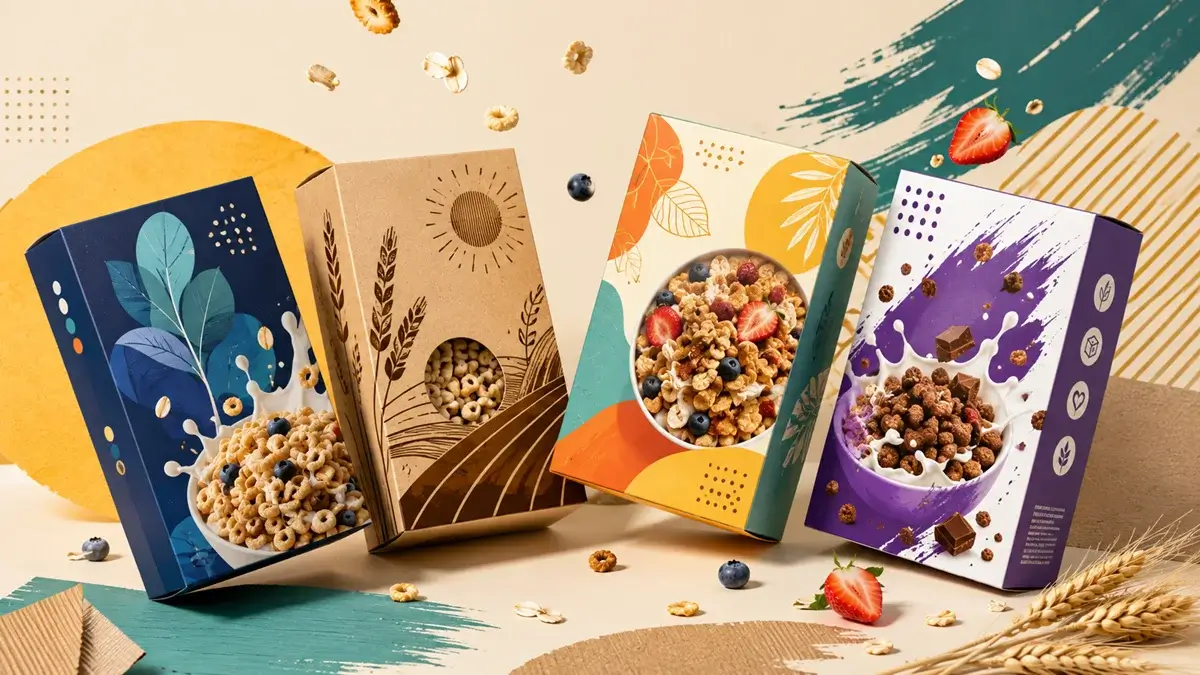
Minimalist cereal box designs
Minimalist packaging continues to grow because it creates a clean, premium appearance without overwhelming shoppers. Simple layouts, generous white space, and carefully selected typography allow the product itself to become the focal point. Health-focused cereals, protein blends, and premium granola products often benefit from minimalist designs because they communicate quality, transparency, and confidence rather than relying on excessive decoration.
Bold and colorful packaging
Bright packaging remains one of the most effective ways to capture attention in busy supermarket aisles. Strong color contrast, oversized graphics, and energetic illustrations naturally draw the eye while helping shoppers recognize products from a distance. Children’s cereals, family-oriented breakfast brands, and limited-edition releases frequently use this approach to create excitement and improve shelf visibility.
Designers should use bold colors strategically rather than filling every available space. A clear focal point, balanced composition, and readable typography prevent colorful packaging from becoming visually overwhelming while maintaining strong shelf impact.
Vintage and retro-inspired packaging
Retro-inspired cereal boxes continue to appeal because they create familiarity and emotional connection through classic design elements. Vintage typography, muted color palettes, textured backgrounds, and nostalgic illustrations remind customers of traditional breakfast brands while giving modern products a distinctive personality.
Retro packaging works especially well for artisan granola, heritage-inspired recipes, and specialty breakfast collections that want to emphasize authenticity. Combining classic artwork with modern printing techniques allows brands to preserve nostalgic charm while delivering the print quality and durability expected in today’s retail market.
Organic and nature-inspired packaging
Natural packaging designs help communicate freshness before customers read the ingredient list. Earth-tone color palettes, botanical illustrations, recycled paper textures, and clean layouts reinforce messages about wholesome ingredients and environmentally responsible practices. Organic cereals, muesli, and granola products often benefit from this approach because the custom packaging immediately supports the product’s positioning.
Natural-inspired packaging should remain simple rather than rustic for the sake of appearance. High-quality printing, consistent typography, and carefully balanced graphics prevent the design from looking outdated while maintaining an authentic brand image.
Premium luxury cereal packaging
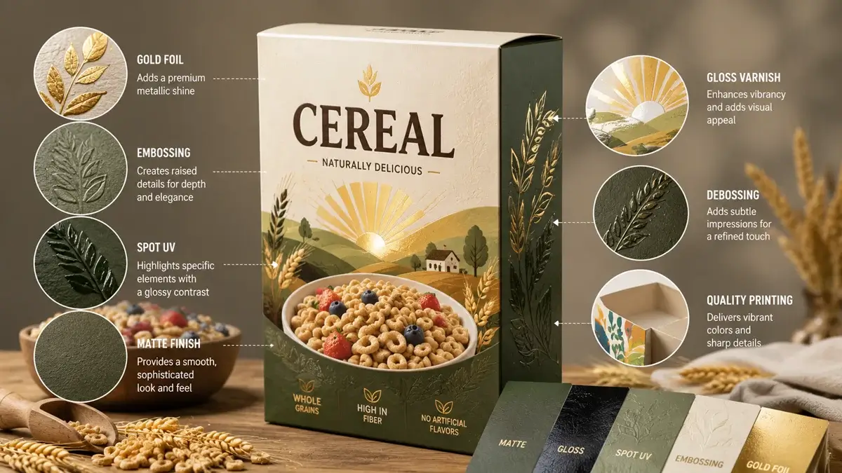
Premium cereal packaging focuses on craftsmanship and perceived value instead of excessive decoration. Matte finishes, soft-touch coatings, foil stamping, and embossed logos create a refined appearance that encourages shoppers to associate the product with higher quality. Minimal color palettes combined with premium paperboard also help specialty cereals compete in premium grocery stores and boutique food retailers.
Luxury packaging works best when every design element feels intentional. Consistent spacing, elegant typography, and restrained use of special finishes often create a stronger impression than applying multiple decorative effects at once.
Character-driven packaging for children’s cereals
Character-based packaging remains one of the most effective ways to connect with younger audiences. Friendly mascots, playful illustrations, and expressive typography create an emotional connection that children recognize quickly while helping parents identify familiar brands.
Interactive storytelling can strengthen this connection even further. Small comic strips, collectible characters, educational facts, or seasonal artwork encourage repeat purchases by giving customers something new to discover with each box.
Interactive packaging with games and QR codes
Interactive packaging transforms custom cereal boxes into part of the customer experience. QR codes can lead shoppers to recipes, games, loyalty programs, or educational content without overcrowding the package design. Printed puzzles, mazes, and creative activities continue to work well for family-oriented products because they extend engagement beyond breakfast.
Interactive features should support the overall brand experience rather than distract from it. Every element should have a clear purpose and provide genuine value to the customer.
Seasonal and limited-edition packaging
Limited-edition packaging creates excitement by giving customers a reason to purchase before the design disappears. Holiday themes, sports events, cultural celebrations, or anniversary editions keep product lines feeling fresh while generating additional attention on retail shelves.
Seasonal updates should maintain core brand recognition through consistent logos, typography, and layout. Familiar branding combined with limited-time artwork helps customers recognize the product immediately while appreciating the exclusive design.
Match your cereal box design to your product category
Different cereal categories appeal to different audiences, so packaging should reflect those expectations instead of following a single design style.
- Organic and healthy cereals: Earth-inspired colors, clean typography, ingredient-focused imagery, and recyclable paperboard help communicate freshness and transparency. These designs often perform best when unnecessary graphics are removed, allowing the product’s natural qualities to become the primary focus.
- Protein and fitness cereals: Bold typography, structured layouts, and high-contrast color schemes emphasize performance and nutrition. Strong visual hierarchy ensures protein content and functional benefits remain easy to identify at a glance.
- Granola and artisan breakfast products: Hand-drawn illustrations, textured backgrounds, and premium finishes reinforce craftsmanship while supporting higher perceived value. Subtle design details often create stronger results than overly decorative layouts.
- Children’s cereals: Bright colors, memorable mascots, playful illustrations, and interactive elements create excitement while making products easier for children to recognize during shopping trips.
- Private-label cereal brands: Clear branding, clean layouts, and consistent packaging systems help retailers build trust while differentiating their products from national brands through value-focused design.
Printing and finishing techniques that enhance cereal packaging
Professional printing transforms a good design into packaging that performs well on retail shelves. Selecting the right finishing technique depends on your audience, product positioning, and budget.
Before choosing premium finishes, consider how they support your overall branding strategy.
- Matte and gloss finishes: Matte coatings create a sophisticated appearance with reduced glare, while gloss coatings produce brighter colors and stronger visual impact. Many premium cereal brands combine both finishes to create contrast and highlight important design elements.
- Spot UV, foil stamping, and embossing: Spot UV draws attention to logos or product names through selective shine. Foil stamping introduces metallic accents that reinforce premium positioning, while embossing creates tactile texture that increases perceived quality without overwhelming the design.
- Choose finishes that support your audience: Luxury cereals may benefit from soft-touch coatings and foil accents, while family-oriented products often achieve better value through vibrant printing and durable gloss coatings. Selecting finishes based on customer expectations creates better results than simply choosing the most decorative option.
Sustainable cereal box packaging ideas
Sustainable packaging has become an important consideration for both brands and consumers. Recyclable paperboard, responsibly sourced materials, and environmentally conscious printing methods allow businesses to reduce environmental impact without compromising visual appeal.
Modern sustainable packaging no longer requires sacrificing design quality. High-quality recycled paperboard, soy-based inks, and water-based coatings produce vibrant packaging while supporting long-term sustainability goals. Brands that communicate these choices clearly can strengthen customer trust and reinforce their environmental values.
Common cereal box design mistakes to avoid
Strong packaging often comes from avoiding common design problems rather than adding more decorative elements.
Before approving artwork for production, review these areas carefully:
- Overcrowded layouts: Too many graphics, fonts, or promotional messages make packaging difficult to read. Prioritizing the most important information creates stronger shelf presence.
- Weak typography: Decorative fonts may look attractive on a computer screen but become difficult to read from a distance. Clear typography improves recognition and helps shoppers identify products quickly.
- Poor color strategy: Bright colors without purpose can confuse customers instead of attracting them. Every color should support the product category, audience, and overall brand identity.
- Ignoring production requirements: Artwork should account for bleed areas, safe zones, fold lines, and dielines before printing begins. Proper file preparation prevents costly production issues and ensures the finished package matches the original design.
Expert tips for creating memorable cereal packaging
Successful cereal packaging combines creativity with practical decision-making. Small improvements often produce stronger results than complete redesigns.
Before finalizing your packaging, keep these recommendations in mind:
- Prioritize one visual focal point: Give shoppers a clear starting point by emphasizing the logo, product name, or hero image. Strong visual hierarchy improves readability and shelf recognition.
- Maintain consistency across product lines: Similar layouts, typography, and branding make it easier for customers to recognize new flavors while strengthening long-term brand identity.
- Test designs before production: Printed mockups reveal spacing, color, and readability issues that may not appear on a computer screen. Physical prototypes also help evaluate shelf impact in realistic retail environments.
- Balance creativity with functionality: Attractive artwork should never reduce readability or interfere with essential product information. Packaging performs best when aesthetics and usability support each other.
Conclusion
Popular cereal box dimensions design ideas succeed when they combine creativity, functionality, and a clear understanding of customer expectations. Thoughtful choices in color, typography, imagery, materials, and finishing techniques help cereal brands create packaging that attracts attention, communicates value, and supports long-term brand recognition. Instead of following every design trend, focus on building packaging that reflects your audience, highlights your product’s strengths, and delivers a consistent experience from the retail shelf to the breakfast table.